Savannah Gerardi Artwork
Monday, January 6, 2014
Good art Vs Bad art
Good art Vs Bad art. What is the diffrence? With the first picture while it may look abstract it is pleasing to the eye with the same cool color pallet while the yellow adds some ligh to the whole picture while the bad picture at the bottom are supose to be of dogs. While the colors are really nice they have no deffinition so at first glance you cant really tell what they are and dogs usually dont have a blue mouth with red and yellow dimond shape teeth.
Thursday, December 19, 2013
Tribal mask
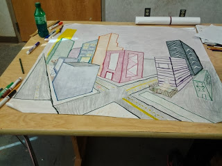
Group 2 point perspective landscape
As you can tell this isnt the best landscape ever but it is okay.
overlaping circle
This project was pretty hard to do but we had to cut out a circle devide it up,cut out a piece and draw a design on it. once we did we cut out another circle and copy the picture on it using light once you had to flip the cut out piece over and once you are done you can color over it.
overlaping sissors
we had to trace sissors over laping each other and where ever a line ended then we changed the colors. as you might be able to tell that thos wasign my best piece of work but I still tried.
symetrical and asymetrical pictures
we had to create asymetrical and symetrical pictures using shapes. we also had to balance the pictures so it would make it look pleasing to the eye. symetrical looks exactly the same while asymetrical can look compleatly diffrent but can't out weigh the other picture.
Hand project
Subscribe to:
Comments (Atom)


